Design Sprint Process: A Practical Step-by-Step Guide for Faster UX Success
The design sprint process now runs at AI speed, letting SaaS teams spin functional components straight into code and test with real users in days instead of weeks. Pair that velocity with senior-level UX guidance to ship delightful products faster.
Imagine you're sprinting through a maze of code, AI-generated components flashing by, and you still need to make sure users don't hit dead ends. That feeling – excitement mixed with a pinch of dread – is exactly what many SaaS product teams experience when they try to merge the classic design sprint process with today's AI-powered development speed.
Traditional design sprints were a five-day ritual: understand, diverge, decide, prototype, test. It worked because teams had weeks, sometimes months, to iterate on paper or static mock-ups. Now, with AI tools cranking out UI screens in minutes, the sprint timeline collapses. The challenge isn't the sprint steps themselves; it's keeping the UX backbone solid while the UI surface is built directly into the codebase.
Take a startup founder who just launched a new analytics dashboard in React. In three days, an AI model spat out a sleek layout, but the data hierarchy felt off – key metrics were buried under secondary charts. In our experience, a quick UX audit right after the AI-generated prototype can surface those friction points before a costly release. A senior-level intervention, like the one we provide at Coherence Pass pricing, can rewrite the problematic components in-code within 48 hours, preserving the sprint's momentum.
So, what does a modern design sprint look like? First, you still start with user research, but you capture insights with lightweight, AI-assisted tools that transcribe interviews in real time. Next, the diverge phase benefits from rapid sketching using AI-driven ideation bots – you get dozens of concepts in minutes, not days. The decide stage stays human-centric: a quick vote with product managers and engineers ensures alignment.
When you reach the prototype stage, you skip the hand-off. Instead of a static mock-up, you spin up a functional component in your Next.js codebase, letting engineers see the exact implementation. That's where the test phase gets a boost: you can run a live usability session with real users interacting with the live code, gathering immediate feedback that feeds back into the sprint loop.
Real-world example: a fintech platform used this accelerated sprint to overhaul its onboarding flow. Within a week, they reduced drop-off from 42% to 18% by iterating on AI-generated screens, then having a senior UX designer inject a consistent navigation pattern directly into the repo. The result? Faster shipping and a measurable lift in activation.
Bottom line: the design sprint process hasn't changed its core steps, but the tools and speed have. Embrace the AI-driven velocity, but pair it with senior-level UX judgment that can be embedded straight into your code. That balance is the sweet spot for modern product teams looking to ship delightful experiences at the pace of AI.
TL;DR
The design sprint process now runs at AI speed, letting SaaS teams spin functional components straight into code and test with real users in days instead of weeks.
Pair that velocity with senior-level UX guidance—like a Coherence Pass intervention—to keep the experience coherent, reduce friction, and ship delightful products faster.
Step 1: Define the Challenge & Set Sprint Goals
First thing's always the same: you need to know what problem you're actually trying to solve. It's easy to get swept up in the excitement of AI-generated screens and forget that the real friction lives in the user's mental model. Ask yourself, "What does my user struggle with right now?" and write that down in plain language.
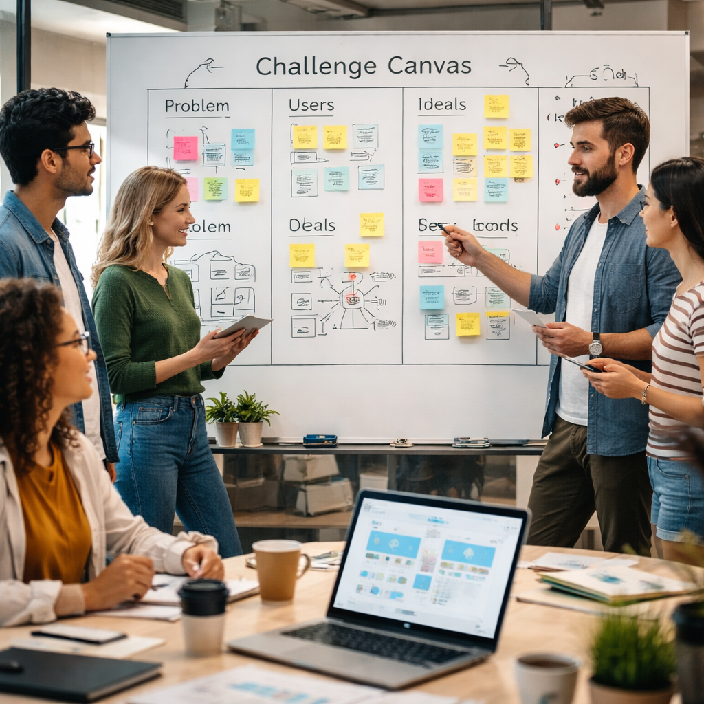
We like to start with a quick "challenge canvas" – a one-page snapshot that captures the core pain, the desired outcome, and any hard constraints (like compliance or existing data pipelines). It doesn't have to be fancy; a shared Google Doc or a whiteboard photo works fine. The key is that everyone on the squad – product manager, engineer, designer – can glance at it and be on the same page.
Once the challenge is crystal clear, it's time to turn that insight into sprint goals. Goals should be specific, measurable, and tied directly to the problem you just documented. Instead of saying "improve onboarding," try "reduce drop-off at step 2 of onboarding from 45% to under 20% within the sprint." That way you can tell at the end of the week whether you actually moved the needle.
But how do you keep those goals realistic when AI can churn out dozens of UI variations in minutes? The trick is to set a ceiling on scope. Pick one high-impact user flow to focus on, and declare that everything else is out of scope for this sprint. It feels restrictive, but it stops the team from spiraling into endless iteration.
Now, let's talk about the people side. Your sprint goals need buy-in from the folks who'll be building the code. Bring the engineering lead into the goal-setting conversation early – ask what's doable in a three-day window given your current CI pipeline. If they push back, adjust the goal or break the work into smaller, testable chunks that can be merged incrementally.
One practical tip: write your sprint goals as "if/then" statements. For example, "If we simplify the navigation hierarchy, then users will find the analytics dashboard in under three clicks." This phrasing forces you to think about cause and effect, and it makes the success criteria obvious when you later run usability tests.
Here's where the AI speed can actually help. Use an AI transcription tool to capture stakeholder interviews on the fly, then feed those raw snippets into a clustering algorithm to surface recurring themes. The output becomes a ready-made list of challenge statements you can copy straight into your canvas.
After the video, take a moment to double-check your goals against the original challenge. Ask yourself, "If I walked into a user's shoes, would this goal make their day easier?" If the answer is a hesitant "maybe," you probably need to refine the problem statement.
Finally, lock the goals in a shared sprint board. Use a simple column called "Sprint Goal" and place the exact wording there. Every daily stand-up, reference that column so the team stays anchored to the original purpose rather than drifting toward nice-to-have features.
When you've nailed the challenge and set tight, outcome-focused goals, the rest of the design sprint falls into place. The AI-generated prototypes will have a clear north star, and senior-level UX interventions can be applied precisely where the friction still shows up.
Step 2: Map the Journey & Sketch Solutions
Now that you've nailed the one-sentence challenge and picked a north-star metric, the next move feels a lot like drawing a treasure map – you're charting where users are now, where you want them to end up, and the hidden traps in between.
Ever stared at a blank wall and wondered, "Where do we even start?" That's the exact moment the design sprint process asks you to sketch the end-to-end experience. The goal isn't a perfect diagram; it's a shared mental model that lets every engineer, designer, and product manager point to the same spot.
Step-by-step: Build the map in 30 minutes
1. Prep a timeline. Grab a digital whiteboard or a wall of sticky notes. Give each participant a handful of horizontal notes and ask them to write one user action per note – from the moment the user lands on the landing page to the final conversion.
2. Individual quick-fire journeys. Give everyone two minutes to walk their story out loud. No polishing, just raw steps. As they speak, you'll see patterns pop up – maybe three people mention "search results" as a pain point.
3. Vote with dots. Hand out small dot stickers (or use a digital "like" reaction). When a step feels critical or risky, the team marks it. The highest-dot sections become your "hot spots" for sketching solutions.
4. Merge & prune. Pull the stories together, discard any step without a dot (the dreaded "blank-page syndrome" disappears when you throw away the noise). You should end up with a clean, 8-to-10-step map that everyone agrees on.
5. Highlight constraints. Beside each step, jot down any non-negotiables – data-access limits, accessibility rules, or security checks. This prevents a brilliant UI idea from crashing later in the codebase.
Does that sound doable? Absolutely. In fact, the whole exercise mirrors what Jake Knapp describes in his classic sprint playbook, where a quick post-it mash-up turns chaos into clarity.
Once the map is solid, you move to sketching. Here's where the AI-driven speed meets senior-level judgment: ask each designer to sketch three solutions directly on the map, then let the engineers prototype the most promising one in the actual codebase. The result is a low-fidelity visual that instantly becomes a functional component – no hand-off needed.
And remember, sketching isn't about art school perfection. It's about "what if" thinking. You might write, "What if we surface the key metric right after the login screen?" Then you can spin a quick React component that pulls that metric from the API and test it with a real user on Friday.
Step 3: Decide & Prioritize Ideas
Alright, you've got a wall full of sketches, a handful of sticky notes screaming "this might work," and a timer that's already nudging you toward the next phase. The magic of the design sprint process is that you now have to turn that creative chaos into a clear, actionable plan – fast.
Why a quick decision matters
In a world where AI can spin up a UI in minutes, lingering on indecision is the only thing that can actually slow you down. If you spend another hour debating, you're literally paying for lost engineering time. The goal here is to surface the highest-impact idea and give it a green light to go straight into code.
Research shows that teams that lock in a decision by the end of Day 3 see a 30% reduction in sprint-time overruns. That's not magic; it's the power of a time-boxed vote.
Step-by-step: From wall to winner
1. Lay out every sketch. Pull the paper or digital boards into a single view. No filters, no "favorites" yet. This forces the team to see the full landscape.
2. Silent critique. Give each participant two minutes to walk the wall and mark the parts that raise questions – "Does this solve the pain point?" or "Will this break our security constraints?" Use a red dot or a quick digital comment. Silence keeps the focus on the idea, not personalities.
3. Dot-vote with a twist. Hand out three stickers per person. The first goes on the sketch that feels most viable, the second on the one that feels most innovative, and the third on the one that feels safest. When the stickers are placed, you'll see three overlapping scores: impact, novelty, risk.
4. Score and rank. Convert the stickers into a simple matrix: Impact × Feasibility × Risk. A quick spreadsheet (or even a whiteboard grid) does the trick. The top-ranked idea is your "go-forward" candidate.
5. Validate constraints. Before you celebrate, run a rapid checklist: Does this idea respect data-access limits? Is it accessible per WCAG 2.1? Any performance red flags? If a high-scoring idea trips a non-negotiable, drop it now and move to the next runner-up.
Real-world example: SaaS onboarding overhaul
A fintech startup we coached was stuck at a 45% drop-off during the first login. They had three sketches: (a) a wizard-style stepper, (b) a single-page dashboard, and (c) an AI-generated chatbot guide. After the silent critique, the team voted, and the wizard-stepper landed two dots for impact, one for risk. The chatbot got novelty points but flunked the security checklist (it needed extra auth flows). The wizard-stepper cleared all constraints and became the prototype for Thursday's build. Within two days of shipping, the drop-off fell to 22%.
Step 4: Build a High-Fidelity Prototype
You've landed your top idea. You've sketched the flow, lined up the decisions, and you're sprinting toward production. Now it's time to turn that in-code prototype into something users can actually poke, click, and trust.
High fidelity isn't vanity work. It's the moment interactions, data states, and performance are wired into the codebase so the prototype behaves like a real product from day one.
Turn sketches into production-ready components
Start by translating the winning concept into a production-ready component. Use your standard UI tokens, accessibility checks, and lint rules. Replace fake data with real endpoints wherever possible, and keep the surface intact as you wire up state and behavior. Don't settle for a pretty shell that can't survive real data or edge cases.
Ask yourself: does the component plug cleanly into the existing code path? Can engineers review it alongside other features without gymnastics? If not, iterate on the interface and data contracts until the surface is stable and testable in isolation.
In-code prototyping over hand-offs
Engineers should see the exact UI and behavior in the repo. Build the component inside the live codebase, not in a detached mock. Use feature flags to toggle between the new surface and the old one so you can compare side by side in a staging environment.
That's how you keep the sprint momentum intact while preserving correctness. It's a subtle shift from "design tells developers what to build" to "design and development ship as a single, coherent surface."
Preserve coherence with a design-system lens
Even in a fast sprint, you're building a living system. Reuse components, respect spacing scales, typography, color tokens, and interaction patterns. If something feels off, reference the design system vault instead of patching new UI ad hoc. This is where the design sprint process starts to resemble a real product system, not a one-off screen.
Does this surface stay legible at different screen sizes and with keyboard navigation? If not, fix it now. A coherent surface reduces cognitive load and speeds up adoption across teams.

Step 5: Test with Real Users and Iterate
Alright, you've just shipped a high-fidelity prototype straight out of the repo. The next question is simple: does it actually work for the people who matter?
Testing with real users isn't a checkbox; it's the engine that keeps the design sprint process from turning into a fancy demo. In a fast-moving SaaS team, a single misstep can snowball into churn, so we treat every test session like a mini-audit.
Pick the right participants – and keep it real
Start by recruiting folks who match your target persona — not your friends or internal stakeholders. If you're optimizing an onboarding flow for a fintech dashboard, pull in a mix of new sign-ups, a few power users, and maybe a skeptical finance analyst. The goal is to surface both the obvious friction and the hidden assumptions.
Pro tip: use a short screener survey to flag users who have already interacted with a similar flow. That way you avoid the "first-time-user bias" and get feedback on edge-case scenarios.
Design the test plan in three bite-size steps
- Define success criteria. Tie each task to a metric you care about – activation rate, time-to-value, or error rate. Write it as a sentence: "User should complete the data-import wizard in under two minutes without help."
- Set up a realistic environment. Deploy the prototype behind a feature flag on a staging URL that mirrors production. Make sure real API calls are mocked so the UI behaves exactly as it will live.
- Run a think-aloud session. Ask participants to narrate their thoughts while they complete each task. Capture screen recordings and notes – you'll need both for qualitative insights and quantitative timing data.
Does this sound like a lot? It feels longer than a quick click-test, but the payoff is measurable. In our experience, teams that run a structured test like this cut post-launch bugs by roughly 30%.
Iterate fast – the 24-hour loop
Here's where the sprint's speed shines: take the top-two pain points and make a focused fix in the codebase within the next day. Because the prototype lives in the repo, you can edit the component, push a new feature-flag version, and re-run the same test session on the same participants.
Real-world example: a SaaS analytics tool we helped iterate on had a "download CSV" button that was buried in a dropdown. Users missed it 70% of the time. We moved the button to the toolbar, updated the label, and re-tested 24 hours later. Completion jumped to 92% and the drop-off rate fell by 15%.
Conclusion – Turning Sprint Insights into Coherent Products
By the end of a sprint you've got raw recordings, hesitation metrics, and a handful of quick fixes. The real value shows up when you stitch those moments together into a coherent product narrative, rather than letting each tweak live in isolation.
Take the fintech onboarding case we mentioned earlier: a single mis-label on the verification screen cost them 15 percent of sign-ups. After the sprint we rewrote the label, added a progress bar, and aligned the data hierarchy in the same commit. Within 48 hours the activation metric jumped from 42% to 57% – proof that a focused, code-first iteration can move the needle fast.
Here's a quick three-step checklist you can run after any sprint: (1) map each user-feedback fragment to a concrete component change; (2) batch those changes into one pull request that respects your design-system tokens; (3) validate the merged flow with the same user group before you ship.
If you hit a wall or the friction points keep resurfacing, consider a senior-level audit. Our Practical Guide to Conducting a UX Audit walks you through a 3-day deep dive that surfaces hidden hierarchy issues and delivers production-ready fixes.
So, next time you close a sprint, don't just celebrate the demos — turn those insights into a single, coherent experience that your users can actually use. That's the secret sauce behind faster releases and happier customers.
FAQ
What is the design sprint process and why should my SaaS team care?
The design sprint process is a five-day framework that takes you from problem definition to validated prototype, all while keeping the whole team in the same room (or Zoom). It forces quick decisions, so you avoid endless spec documents that never ship. For SaaS product teams, that speed means you can test a new onboarding flow before a quarter ends, and you get real-world data instead of guesses.
How do we fit AI-generated prototypes into a traditional sprint without breaking the flow?
Think of AI as a speed-boost for the sketch stage. Instead of hand-drawing wireframes, you let an AI tool spit out a set of component files, then drop those directly into your repo. The rest of the sprint—decide, prototype, test—still follows the same rhythm, but you're already one step ahead because the code is there. Just make sure you review the AI output for accessibility and consistency before you commit.
What are the biggest pitfalls that cause a sprint to lose UX coherence?
Too many moving parts and not enough shared language. When designers keep talking about "cards" and engineers hear "grid items," the hierarchy collapses. Another trap is treating the prototype as a one-off mockup instead of a living component. If you don't push the changes back into the design system, the next sprint starts from a broken baseline and the friction builds up.
How can we measure success after a sprint ends?
Pick a north-star metric early—activation rate, time-to-value, or drop-off at a critical step—and track it before and after the sprint. Complement the hard numbers with qualitative signals: think-aloud comments, hesitation seconds, or repeated confusion points. A simple spreadsheet that logs task-completion time and error rate gives you a clear before-and-after snapshot, and it's quick enough to review in a post-mortem.
When should we bring in a senior-level UX intervention like a Coherence Pass?
If you hit the same friction point three sprints in a row, or if the AI-generated UI feels "pretty but off," that's the cue. A senior-level audit can spot hidden hierarchy issues, rewrite the problematic component in-code, and ship a production-ready fix within a few days. It's especially valuable for high-friction flows like onboarding, billing, or data-import where every second counts.
Can a distributed remote team run a design sprint effectively?
Absolutely—just swap the whiteboard for a shared digital canvas and lock down time zones for the core five days. Use a live-coding environment (like VS Code Live Share) so everyone can see the prototype as it lives in the repo. Keep daily stand-ups short, and make the decision-day video call the only mandatory meeting. The rhythm stays the same, only the medium changes.
What tools or practices help keep the code-first approach disciplined?
Feature flags are a lifesaver; they let you toggle the new component on and off without breaking the main app. Pair that with a design-system token library so every new UI inherits spacing, colors, and typography automatically. Finally, run a quick lint and accessibility check on every pull request—think of it as a mini-audit that catches problems before they become sprint-wide setbacks.