Beyond the Course
Overview
Beyond the Course is an AI-powered learning partner designed to remove friction from self-education. It searches YouTube for high-quality learning content, analyzes transcripts, identifies knowledge gaps, and builds structured learning paths. An AI mentor then supports users as they move from passive consumption into active application.
The intelligence layer was strong.
What needed refinement was how that intelligence was experienced.
The Initial Experience
The product opened with a clean prompt:
What do you want to master?
After submitting a topic, users were dropped into a full three-column interface:
- Left: Learning hierarchy (partially populated)
- Center: Generic instructional content
- Right: AI mentor chat (25% width sidebar)
Technically, the system worked.
Experientially, it felt premature.
The interface exposed structure before it had earned user trust.
Empty Sidebar
The Learning Path is still being created, leading to user confusion
Inappropriate Context
The main content area shows non-relevant information
Constrained Chat
The only active element of the system is confined to a small column
The Core Problem
AI systems fail when they reveal complexity before clarity.
The original experience treated all features as equally visible at all times:
- Deep accordion hierarchies
- Placeholder content
- Constrained chat column
- Incomplete system states
- Manual refresh requirements
But learning is sequential.
Trust is sequential.
Clarity must be phased.
The product needed dynamic hierarchy, not static layout.
Strategic Approach
We preserved the existing React architecture and Tailwind foundation.
Rather than redesigning from scratch, we:
- Rebuilt modular front-end components
- Introduced phase-based interface logic
- Rebalanced screen real estate
- Simplified hierarchy without reducing depth
- Optimized chat as the primary surface
The goal was structural coherence — not aesthetic overhaul.
Phase-Based Interface Design
The product naturally operates in phases:
- Learning path generation
- Topic exploration
- Active learning
- Project application
Originally, all phases were visually collapsed into a single layout.
We separated them.
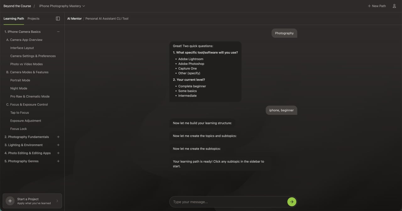
Learning Path Generation
During learning path generation:
- The interface focuses primarily on the AI mentor.
- Incomplete navigation remains hidden.
- System activity is visually reinforced.
- Chat auto-scroll ensures continuity.
- Manual refresh is eliminated through automatic state transitions.
Users now experience anticipation instead of confusion.
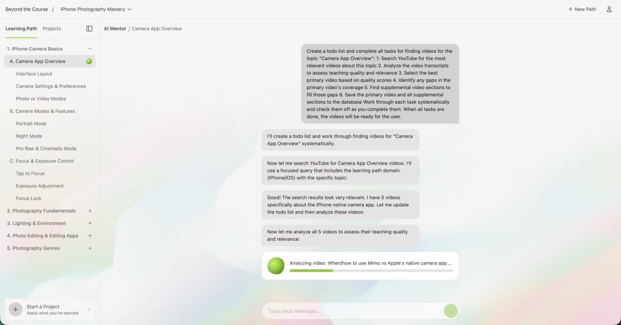
Topic Exploration
Once the learning path is generated:
- The learning path sidebar is introduced intentionally.
- Topics and subtopics appear only when populated.
- Content loads dynamically.
- The AI mentor remains contextually aware of the selected topic.
The interface expands with meaning — not noise.
Active Learning & Projects
The project phase — where users apply learning — is one of the most powerful features of the product.
We optimized:
- Chat container widths for readability
- Reduced scroll friction for long responses
- Clear visual distinction between learning and project work
- Layout flexibility via collapsible sidebar
The mentor interaction now feels central, not constrained.
Chat System Optimization
The AI mentor is the core value of Beyond the Course.
Originally constrained to a narrow 25% column, long AI responses became difficult to read and navigate.
Improvements included:
- Increased horizontal space allocation
- Phase-aware container widths
- Scroll anchoring to the latest message
- Reduced disruptive scroll behavior
- Automatic state-based transitions via polling and WebSockets
- Cleaner message rendering
Long-form AI guidance is now readable and intentional.
When the mentor speaks, it feels primary.
Perceived Performance & Trust Mechanics
AI systems can feel like black boxes.
Without visible feedback, users assume the system is stuck.
We introduced:
- A controlled 30-second visual progress indicator
- Subtle animated feedback during AI processing
- State transitions tied to backend updates
The average response completes roughly 50% faster than the visual timer.
The system feels fast because it exceeds expectations.
This builds psychological trust without manipulating functionality.
Learning Path Hierarchy Simplified
The backend generates rich, nested topic trees.
The original interface exposed this depth through heavy accordion nesting.
We simplified presentation while preserving structure:
- Fewer top-level accordions
- Clear indentation patterns
- Reduced visual noise
- Stronger active-state indicators
- Cleaner grouping of subtopics
The data model remains sophisticated.
The user experience feels intuitive.
Typography & Visual System
We recalibrated the visual language to align with modern AI tools.
Implemented:
- Inter as primary typeface
- Normalized type scale and weights
- Reduced font size variance
- Increased white space
- Cleaner spacing rhythm
- Dark mode via CSS variables
- Improved color contrast
The interface now feels calm, modern, and credible.
In AI products, visual restraint signals intelligence.
What Was Delivered
Coherence Pass engagements produce working systems, not mockups.
1. Production-Ready Front-End Code
All improvements were implemented in a dedicated Coherence Pass branch:
- Refactored React components
- Phase-based layout restructuring
- Chat container optimization
- Hierarchy refinements
- Typography normalization
- Scroll behavior improvements
- Dark mode implementation
- Automatic state transitions
The client received clean, modular, reviewable code.
2. Loom Walkthrough
A detailed Loom walkthrough was delivered explaining:
- What changed
- Why it changed
- The UX principles behind each decision
- What was deliberately preserved
- Where future evolution is possible
Clarity of reasoning is part of the deliverable.
3. Backend & Interaction Recommendations
While the front-end resolved immediate friction, additional opportunities were identified:
- Shorter, more interactive AI responses
- Step-by-step conversational scaffolding
- Reduced monolithic message payloads
- Increased conversational state awareness
- Expanded micro-interactions and UI personality layers
- Branded interaction moments
The result was both an improved interface and a roadmap for continued evolution.